Did you ever wonder who created the classic design for the Whole Foods Market 365 logo? It is an iconic logo that is on millions – maybe billions of packages.
When I met Nancy Frame in the early ’90s, I worked for GoodMark Foods. They are the company that purchased Rachel’s Brownies, the company my wife started, and we built together. GoodMark had a portfolio of brands, including the iconic Slim Jims. Nancy helped me with some packaging design for the Andy Capp brand and a range of other graphic design projects. Nancy Frame Design based in Durham has done some remarkable work.
What I didn’t realize at the time was that Nancy and her partner Bob were also working with a local business called Wellspring and their brilliant owner, Lex Alexander. Together, they brought 365 to life.
Wellspring
In 1992, there were two Wellspring stores, one in Durham and one in Chapel Hill selling organic specialty foods. My wife and I were regular patrons as we loved the vibe, vegetables, and the worldview. When the stores were acquired, they became the twelfth and thirteenth stores in the Whole Foods chain.
Whole Foods Market wanted the stores, and they wanted Lex and his European orientation toward food and organic products. His genius and foodpreneur expertise were instrumental in guiding the growth of the burgeoning food chain.
Nancy had worked with Wellspring on product packaging design. And when Lex became part of the leadership team at Whole Foods, he was responsible for the development of their private label products.
Whole Foods Market
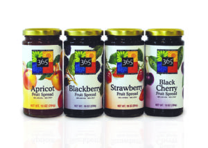
Lex’s first private brand for Whole Foods Market was a high-end line of premium products close to his heart. The premium brand featured “food discoveries” Lex found in his travels around the globe, curated through the lens of his southern roots. Each product package was carefully designed by Nancy using original illustrations.
Lex also created products where he saw the opportunity to offer shoppers a better option, like upscale organic mayonnaise flavored with lemon. Duke’s Mayonnaise, for example, a southern legend that Lex relished, was the inspiration for the Whole Foods Organic mayonnaise private label product.
Many of these products were specialty foods like European-style precooked beans packaged in glass instead of cans. Together, Lex, Nancy, and Bob created beautiful packaging for Italian pasta, bottles of vinegar, and preserves. Each product had unique artwork that set it apart on the shelf.
365 Every Day Value
![]() Lex realized that as Whole Foods Market was growing, the stores needed a private label brand that could bring more mainstream customers into the store. Nancy’s husband Bob, working with Lex, exchanged strategic concepts as they analyzed the information they learned.
Lex realized that as Whole Foods Market was growing, the stores needed a private label brand that could bring more mainstream customers into the store. Nancy’s husband Bob, working with Lex, exchanged strategic concepts as they analyzed the information they learned.
One day, Lex said, let’s create our brand platform around the idea of 365 to signify the everyday experience.
Quickly, 365 became a strategic imperative for Whole Foods. Bob and Lex thought they could create a private brand oriented around the sweet spot of price and image? But it needed a brand visualization that could elevate the everyday.
Design Challenge
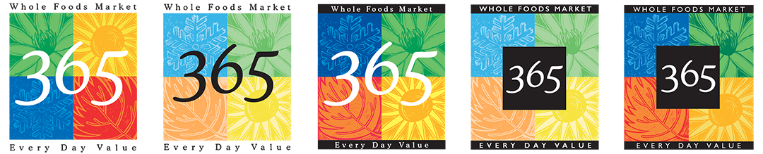
Faced with the design challenge, Nancy started thinking about how important the seasons would be in the brand’s image. She wanted to create something that would pop off the shelf and be unique to Whole Foods Market. And, the design had to work on a myriad of shapes, sizes, and packages.
Nancy knew that seasonality was vital to the image – the idea that you wanted to buy fresh, local products in season. So, she played around with four boxes that each represented summer, fall, winter, and spring.
 Nancy chose a font called Cooper Light for the numerals 365 – Cooper is a traditional serif font with Old Style numerals that linked the 365 brand to the Whole Foods Market brand mark. It’s a super friendly font with a casual elegance. And she chose to pair it with Gil Sans, a sans serif humanist font that exudes a modern feel with its highly legible, generous characters.
One of my favorite elements of the design is that the number 6 was elevated higher than the 3 and 5.
According to Nancy, this whimsical element made the numbers have more life and personality. It is one of those fine touches not everyone sees but helps make a logo sing. And subtly, the raised 6 implied a higher level of quality.
When Lex presented the brand and the 365 logo to Peter Roy, the Whole Foods Market President, everyone loved Nancy’s work.
Through several iterations, she landed on a clean, crisp design. And, the response was remarkable. 365 helped to attract new mainstream customers to the stores and accelerated growth. 365 was on products across most of the categories of goods sold in the store.
The Story of 365
I asked Nancy and her husband, Bob about the 365 design. 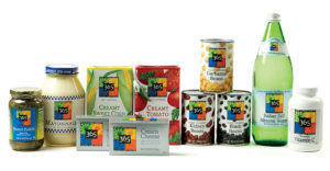
“We started working with Whole Foods Market in 1992 when they had 13 stores. Over the next two decades, we created branding, store graphics, and private brand package designs that powered Whole Foods Market growth to 456 stores in the US, Canada, and the UK. We designed the 365 logo and package design system to help Whole Foods Market attract conventional grocery store customers with a value-priced line backed by Whole Food Market’s reputation for quality. In a letter to stockholders, John Mackey, founder, and CEO said: “ It would be hard to exaggerate the success of the 365 brands.”
Around 2015, Whole Foods Market started to test the concept of 365 stores, separate from WFM. The redesign of the logo increased the 365 and decreased the size and position of the season’s squares. That is what the design looks like today. They also combined the words every and day to everyday in the current variation.
The 365 stores wanted to attract millennials. After the Amazon acquisition, they closed the five stores to focus on the mothership and their new relationship with online retailing.
Amazon
After Amazon bought Whole Foods Market, they immediately put the 365 brands on Amazon, and it fast became one of their best-selling private label brands, just behind Amazon Basics. According to Nancy, Amazon has sold 10 million dollars of product in the first four months after they went on-line.
Although no longer working on Whole Foods package design today, the core of her original 365 logo and designs lives on millions of products sold.
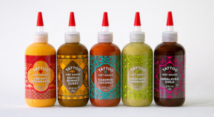 Today Nancy and her partner Bob, work with a range of brands in food, beverage, and other categories. Recently, she did some beautiful work on a line of flavored hot sauces called Tattoo like avocado serrano. It is some of the most exciting packaging work I have seen in years.
If I had to define the quality of Nancy’s talent, I’d say it is the opposite of ordinary.
She has an artist’s eye and flair for the surprise in her work. Her package design work is electrifying, whimsical and always strategic.
Best of all, Nancy brings the eye of a master artisan, 365 days of the year.
Does your business need a human marketing coach, guide, or sherpa? Are you generating enough leads? Is your marketing underperforming? I can help.
You can set up a time to chat with me about your marketing challenges using my calendar. Our initial conversation is free. You talk, I listen. Email me jeffslater@themarketingsage.com or call me. 919 720 0995. Visit my website at www.themarketingsage.com Let’s explore working together today.

To learn more about Nancy and Bob’s work, visit www.nancyframedesign.com


Amazon just introduced a much less sophisticated and say, economical looking logo in January of 2020. Does this mean a change in their product quality? Any thoughts on this?
When a company refines a logo, it is often a strategic signal about a change in strategy. But sometimes, it is just cleaning up graphics. I don’t know which it is in this case. My guess is that like any logo evolution it is a little of both. But, I doubt they are signaling to change all of their product’s quality.