I’ve been in a lot of packaging reviews lately—brands at every stage, from scrappy startups to mid-sized companies trying to grow their retail footprint. The categories are different. The products are different. The founders are different.
The problem is always the same.
The front panel is trying to do too much.
I get it. You’ve poured everything into this product. You know every ingredient, every benefit, every reason someone should choose you over the twelve other options on the shelf. You want the package to say it all. But the shopper isn’t reading. They’re moving. And you have about one second, maybe two, to stop them.
One second is not a brochure. It’s a billboard.
The Shopper’s Brain Is Already Full
Walk into any grocery store and pay attention to what’s happening. People are checking their phones. They’re thinking about dinner. They’re deciding whether to grab something else from the next aisle. The cognitive bandwidth available to your package in that moment is almost zero.
This is not the moment to communicate eight things. It’s the moment to communicate one thing clearly enough for it to register.
When I work with brands on front-panel design, I push them toward a simple framework: tell me the product form, one key benefit, and the flavor or variety. That’s it. Three things. Often two is better.
Product form: What is this? A chip, a bar, a drink, a sauce?
Key benefit: Why does it matter? Not seventeen reasons. One. The one that makes your brand different from everyone else in the category.
Flavor or variety: Spicy Mayo. Sparkling Ginger. Tangy Tomato. This sounds obvious, but it gets buried all the time, and people need to know what it will taste like right away.
If a shopper can read those three things in one glance and understand what they’re looking at, you’re in good shape. If they have to work for it, you’ve already lost them.
The Badge Trap
Here’s where things go sideways. Someone on the team, sometimes a founder, sometimes a salesperson preparing for a retail pitch, starts adding badges.
Non-GMO. Gluten-free. Vegan. Keto-friendly. Woman-owned. B Corp certified. Made in small batches. No artificial flavors. Not tested on animals. Regenerative. Keto-friendly. Paleo-inspired.
Each of those things may be core to the brand.
Each of them matters to some shopper somewhere.
But piling them onto the front panel doesn’t make the package more compelling. It makes it harder to read. It creates visual noise that competes with the message you actually need to land.
I call this the badge trap. Brands use certifications and claims as a proxy for having a clear positioning. If we can’t explain why we’re different in one sentence, maybe we can convince people with a collection of stamps. It doesn’t work that way.
Badges belong on the back of the pack. The shopper who cares about your Non-GMO certification will look for it once they’ve already decided to pick up the product. Your job on the front panel is to get them to pick it up.
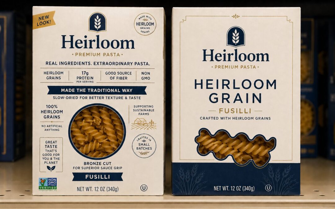
Two Packages. Same Product. Completely Different Conversation.
The image of the fusilli pasta is a hypothetical, but it captures something I see in real packaging reviews every week.
Remember, this isn’t a design exercise; this is a messaging challenge first.
Two versions of Heirloom Pasta, side by side on a shelf. Same brand. Same product. Very different front panels.
In 2 seconds, I get the message from the box on the right. I’d need a weekend to read the box on the left.
The package on the left is working very hard. Count the claims: heirloom grains, 17g protein per serving, good source of fiber, non-GMO, made the traditional way, slow-dried for better texture and taste, 100% heirloom grains, no artificial anything, great taste that’s good for you and the planet, supporting sustainable farms, crafted in small batches, bronze cut for superior sauce grip. That’s before you get to the Non-GMO Project Verified badge in the corner and the “New Look!” callout at the top.
Every one of those claims is true. Several of them are genuinely interesting. But together, they create a package that requires a shopper to slow down, scan, prioritize, and decide what matters. Most shoppers won’t do that. They’ll move on.
Now look at the package on the right. Brand name. Product type. Variety. One supporting line. A window showing the pasta.
That’s it. And it’s enough. At a glance, you know exactly what you’re holding and what the brand believes is worth saying about it. Heirloom grain pasta. If that’s what you’re looking for, you’ve found it.
The busy package says: “Here are 15 reasons to buy me.” The simple package is saying: here’s exactly what I am. If that matters to you, pick me up.
The more claims you add, the less any single claim lands. Simplicity doesn’t remove meaning. It amplifies the meaning that matters most.
What Clarity Actually Looks Like
Think about the brands that cut through on the shelf. The ones that are easy to find, easy to understand, easy to hand to someone else, and explain.
They made a choice. One thing, said clearly, reinforced by the design. The color, the typography, the imagery, the hierarchy, all of it points in the same direction. There’s no visual tug-of-war between the benefit claim, the certification badge, the flavor callout, and the origin story, all compressed into four words.
That clarity is not an accident. It is the result of someone making a hard decision about what not to say.
When I’m in a packaging review and a brand can’t tell me their single key benefit without a five-minute explanation, that’s a positioning problem, not a design problem. The package is a symptom. The confusion started earlier, before anyone opened a design file.
Getting to one clear benefit requires being honest about what actually makes you different in the category your customer is shopping, not the category you wish you were in. That’s a harder conversation than picking a font. But it’s the conversation that determines whether the package works.
The Back Panel Exists for a Reason
Everything that doesn’t belong on the front panel has a home. The back panel, the side panel, the inside of the lid, and the QR code that links to your full brand story. These are the places for nuance, credentials, the founder’s letter, and the ingredient glossary.
A shopper who has already picked up your product and is reading the back is a different person from the one passing your product on the shelf. They’re interested. They have a moment. Give them everything then.
But you have to earn that moment first. The front panel earns it.
I’ve seen beautifully designed back panels on products that never got picked up because the front panel couldn’t do its job. All of that detail, all of that care, wasted because the first impression didn’t land.
Think of the front panel as the invitation. You’re not trying to give someone the whole party on the doorstep. You’re trying to get them inside.
Three Key Takeaways
1. You have one job on the front panel, and it is not education. It is getting noticed in the category.
The front panel is a communication tool with a single purpose: to stop the shopper, help them understand what they’re holding, and give them a reason to flip it over or put it in the cart. That’s the whole job. The brands that struggle on the shelf are usually the ones that have turned the front panel into a lecture. Teach later. Connect first.
2. If you can’t name your one key benefit without a qualifier, you don’t have a benefit yet.
“We’re kind of like X, but also Y, and we appeal to people who care about Z” is not a benefit. It’s a positioning problem dressed up as a feature list. Before you finalize your front panel, you should be able to say, in one short sentence, what makes your product different from everything else next to it. If you can’t do that, go back to the previous strategy before going to the printer.
3. Badges signal insecurity, not quality.
Certifications and claims have real value in the right place. On the back panel, they reassure the committed shopper. On the front panel, crowded together, they read as noise. The implicit message of eight badges is that you don’t trust one strong idea to do the work. The shopper picks up on that. Move what belongs on the back to the back, and let the front do what only the front can do.
The best packaging I’ve seen lately is the packaging that knows what it isn’t trying to say. That’s the discipline that separates the brands that cut through from the ones that crowd themselves out.
The front panel is not a conversation. It’s a first impression. Make it count.
Connect with Jeff at The Marketing Sage Consultancy. Interested in setting up a call with me? Use my calendly to schedule a time to talk. The call is free, and we can discuss your brand and marketing needs.

Would you like to read some testimonials about my work? Click here.
If you want to learn more about my new offering, The Trusted Advisor Board, click here for details. Feel free to email me at jeffslater@themarketing sage.com or text 919 720 0995. Thanks for your interest in working with The Marketing Sage Consultancy.


