Brand Consistency Builds Mental Real Estate
In an era obsessed with rebrands, refreshes, and “modernization,” some of the world’s most valuable brands have quietly maintained the same visual identity for over a century. While agencies pitch the latest design trends and competitors chase fleeting aesthetics, these iconic brands demonstrate a profound truth: lasting recognition isn’t built through change, it’s built through consistency.
Four Logos That Stood the Test of Time
Arm & Hammer (1867 – 158 Years)
The Arm & Hammer logo, featuring a muscular arm wielding a hammer, has remained virtually unchanged since its introduction in 1867. What began as a symbol for Vulcan, the Roman god of fire and metalworking, became one of America’s most enduring brand marks. Through the Industrial Revolution, two World Wars, the Digital Age, and numerous design movements, that arm and hammer remained unchanged.
The genius? When consumers see that logo, they don’t just recognize a baking soda brand; they access generations of accumulated associations: grandmother’s cleaning remedies, time-tested reliability, and multi-generational trust.
That’s not marketing—that’s cultural memory.
Twining’s Tea (1787 – 238 Years)
The Twining’s logo—featuring a capitalized font beneath a lion crest—has remained unchanged since 1787, making it the world’s oldest continuously used logo. For perspective, this logo predates the French Revolution, the entire Industrial Revolution, and the founding of most modern nations.
Even more remarkable: Twining’s has operated from the exact location on London’s Strand since 1706. While the world around it transformed—through world wars, the fall of empires, and the digital age—that logo never wavered. The result? A tea brand is now distributed in over 100 countries, with instant recognition built over two centuries of unwavering visual consistency.
Bass Ale (1876 – 149 Years)
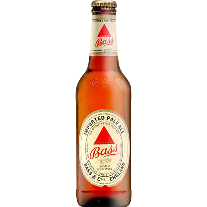
The Bass red triangle became the United Kingdom’s first registered trademark in 1876, and it remains essentially unchanged today. This simple geometric shape has survived Victorian England, modernist design movements, minimalist trends, and the digital revolution.
The red triangle appears in Édouard Manet’s 1882 painting “A Bar at the Fotheringay,” cementing its place not just in commerce but in cultural history. Try that with a logo you changed three times in the last decade.
Coca-Cola (1887 – 138 Years)
The Spencerian script logo created by Frank Mason Robinson in 1887 has undergone only minor refinements in nearly 140 years. While competitors cycled through numerous redesigns to capture “the next big thing,” Coca-Cola invested in a singular visual identity.
The result? The Coca-Cola wordmark is recognized by 94% of the world’s population. That recognition didn’t happen through clever rebrands—it happened through relentless, stubborn consistency.
The Neuroscience of Logo Consistency
Here’s what most brands miss: your logo isn’t just a visual mark—it’s a neural pathway.
Every time a consumer sees your logo, their brain strengthens the connections between that image and their experiences with your brand. Changing the logo prompts the brain to form entirely new neural pathways while the old ones atrophy.
Brand recognition operates like memory formation. Repetition strengthens recall. Consistency builds automaticity. When you change your logo, you’re not “refreshing” your brand—you’re deleting carefully constructed mental real estate and asking customers to start over.
Think of it this way: you’ve spent years training your customers’ brains to recognize you instantly.
Then you hand them a new test and wonder why recognition scores drop.
Three Critical Filters Before Changing Your Logo
Before you greenlight that rebrand, run your decision through these three filters:
1. The Recognition Test: Is Your Current Logo Actually Failing?
Ask yourself: Do customers fail to recognize us, or do we find our logo boring? There’s a massive difference. Internal boredom is not a customer problem—it’s an ego problem.
Apply this filter: Survey actual customers (not your design team) about logo recognition and associations. If recognition is high and associations are positive, you don’t have a logo problem; you may have a distribution, product, or messaging problem.
Don’t have surgery when the patient isn’t sick.
2. The Equity Calculation: How Much Brand Value Are You Erasing?
Every year your logo remains consistent, you accumulate brand equity—the mental shortcuts, positive associations, and instant recognition that money can’t buy overnight. A logo redesign doesn’t reset this counter to zero, but it does create depreciation.
Apply this filter: Calculate how long your current logo has been in the market and estimate the investment you’ve made in building recognition (including advertising, packaging, signage, and digital presence). Now ask: Is the new direction worth destroying that investment? Sometimes the answer is yes (if your current logo has toxic associations or severely limits growth). Usually, it’s not.
3. The Evolution vs. Revolution Test: Can You Solve This Through Refinement?
There is a reason Coca-Cola, Twinings, Bass Ale, and Arm & Hammer have survived—they’ve refined, not replaced. Small, evolutionary changes maintain equity while allowing for contemporary adaptation.
Apply this filter: Before complete redesign, explore whether thoughtful refinement addresses your actual needs. Can better typography, updated color specifications, or refined proportions achieve your goals while maintaining recognition? If you’re solving for “looks dated,” evolution beats revolution every time.
The Bottom Line
Logo longevity isn’t about stubbornness; it’s about understanding how human memory and brand recognition work.
Arm & Hammer, Twinning Tea, Bass Ale, and Coca-Cola aren’t successful despite keeping the same logo for over a century—they’re successful, in part, because of it.
Every time you’re tempted to chase the latest design trend, remember: your competitors are changing their logos, hoping to capture attention. You could be the brand that stays consistent, capturing memories instead.
In the long game of brand building, consistency isn’t boring; it’s a strategic approach. Recognition isn’t accidental—it’s architectural. And mental real estate isn’t rented, it’s built, brick by brick, year by year, with patient, disciplined consistency.
I’m not arguing that there is never a reason to change or refresh a logo.
But to me, the question isn’t whether you can afford to keep your logo; it’s whether you can afford not to.
What will you gain and what will you lose?
Ask both questions if a logo change might be happening in 2026.
Connect with Jeff at The Marketing Sage Consultancy. Interested in setting up a call with me? Use my calendly to schedule a time to talk. The call is free, and we can discuss your brand and marketing needs.
If you the details. Feel free to email me at jeffslater@themarketing sage.com or text 919 720 0995. Thanks for your interest in working with The Marketing Sage Consultancy.